WDX1 CLM – Case Study
Building a multibrand design system for WDX1 - CLM for large private banks and wealth divisions of global financial institutions
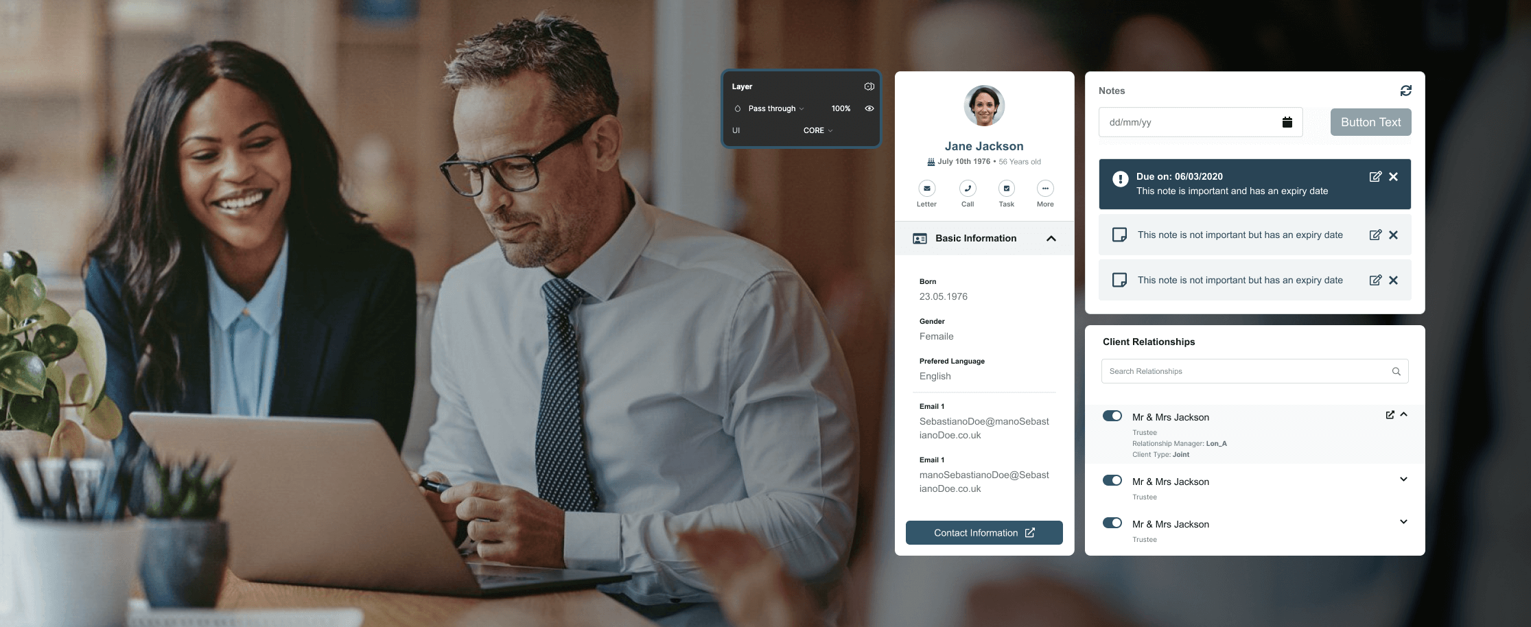
This case study breaks down my work in conceptualising and creating a multi-brand design system for WDX1 Team and their partners fostering consistency, efficiency, and a seamless user experience. The most interesting achievement here is not the design system itself but the underlying processes and changes (business, WoW) involved.
Role
Lead Product Designer, Design Systems
Team
8+ product teams, functional consultants, engineering
Focus
Design system, Tokens, Ways of working
The problem
What impact can a poorly managed design system have on a product development team?
Beyond the obvious issues like inconsistencies, it goes much deeper. Think wasted developer time, repetitive tasks, unwanted bugs, and unpredictable UI/UX behaviour, all of which can ultimately cost the company a significant amount of money both in the short and long term.
This isn't something that can be fixed with a quick patch; it requires a well-planned strategy. In this case study, I'll walk you through how I worked with a team to deliver a multi-brand design system, and restructure the ways of working around design system usage, contribution and updates.
Why a design system redesign restructuring is needed?
1 fully configurable CLM platform, 8+ product teams, all consuming 1 central library, each making 'X' modifications and implementing changes into 1 Web UI library. The result: multiple discrepancies across the platform.
Prior to the new process, WDX1 lacked a real source of truth and adequate documentation. Different product teams interpreted existing design system guidelines in various ways, with no central steering on DS input and changes, leading to inconsistencies across the platform.
The contribution process/structure looked something like this:
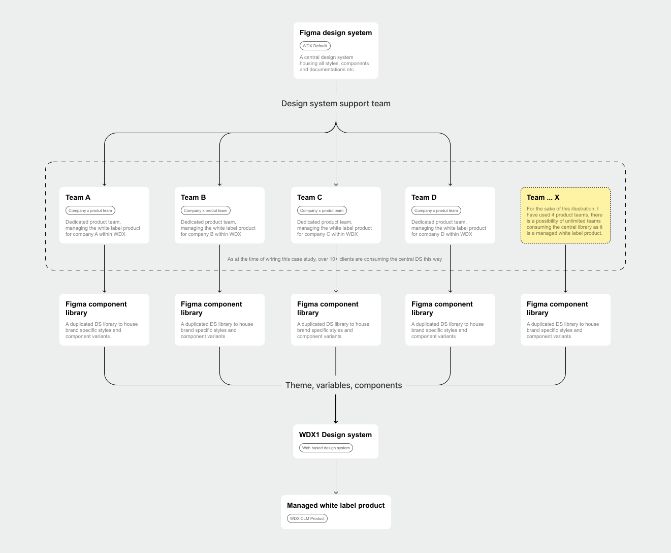
Multiple UI discrepancies, uncoordinated design system contributions
Different teams contributing to the design system without a well-thought-through approval process led to several inconsistencies across the platform. Variables, colors, components, fonts, font sizes, and CSS libraries were added by devs, ultimately resulting in a bloated CSS file and disorganised component library.
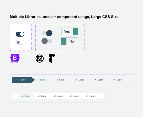
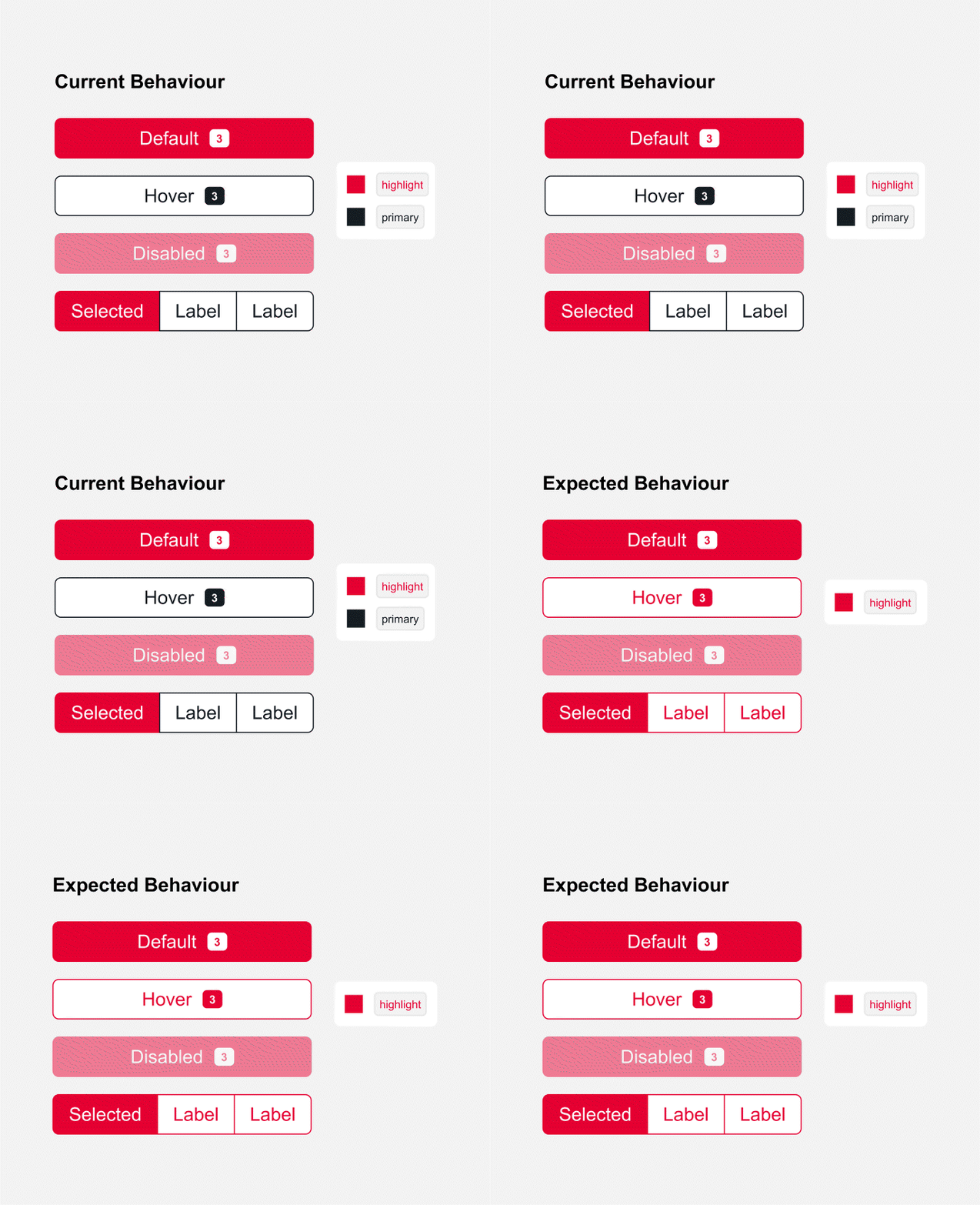
Multiple hard-coded variables, code overrides and unpredictable behaviours
Without proper documentation, misuse is inevitable, and that was the case here. Component usage and behaviours were interpreted in different ways, and quick fixes and patches resulted in unpredictable behaviour for some components within the system, ultimately leading to accessibility and usability issues.
How might we create a scalable design system that accommodates a wide range of brand styles and remains adaptable for future components, while also establishing a robust and efficient structure for collaboration, contribution, and approval?
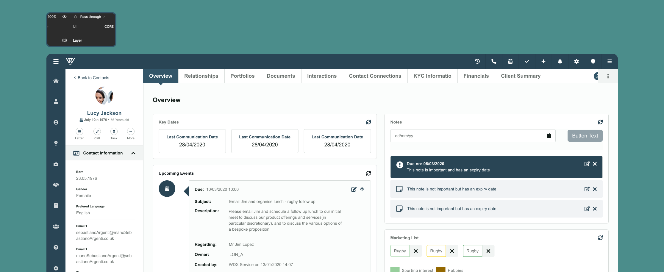
The WDX Multi-Brand Design System is a flexible framework built to support multiple brands, ensuring consistent design across themes while offering easy customisation for designers and developers. This system streamlines the design and development process, making it scalable and adaptable for future growth.
How I tackled this problem
My super 4R technique (I made the name up 😅). Research the true extent of the problem and the approach to solving it, Redefine the core building blocks, Redesign/improve the component library & build, Restructure the underlying ways of working and approval process.

1. Research
A thorough investigation to understand the true extent of the problem.

2. Redefine
Redefining the core building blocks of the design system for a new approach.

3. Redesign
With a strong foundation in place, I redesigned the design system itself.

4. Restructure
Once the problems were identified, I tackled the underlying structure.
Stage 01
Research: I began with a thorough investigation to understand the true extent of the problem.
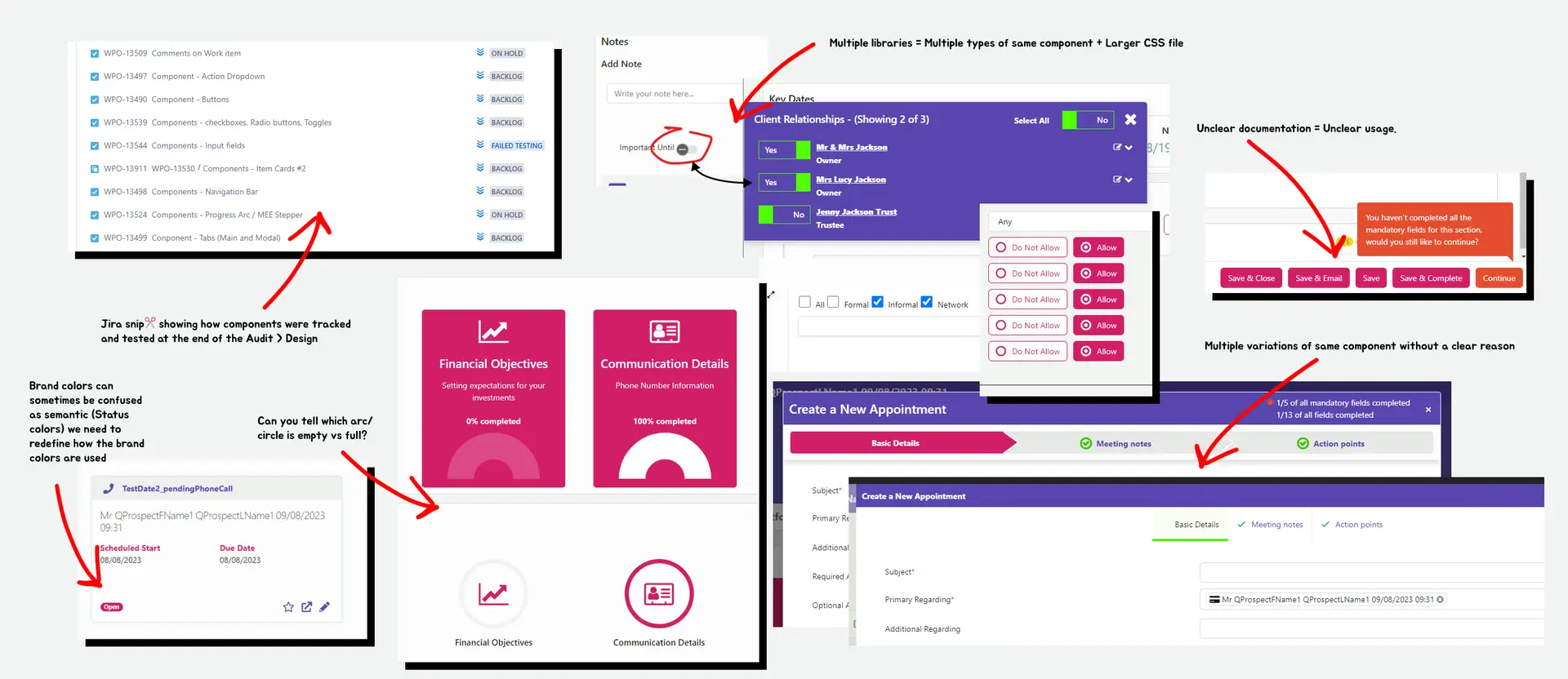
To better understand the current state of my existing design ecosystem, I started with a UX/UI inventory and audit of my main interface components.
The plan was to screenshot unique instances of all existing components, identify inconsistencies in my design assets, check existing documentation and individual, team-based use cases, consolidate the different variants available, and register them for tracking on Jira.
What I found further proved the need for a more systematic approach to documenting, communicating, and maintaining my design system. Here's a rough scrapboard…
On to the next?
Research to help understand consumption and implementation processes for the design system to inform current ways of working within existing product teams
What I did: Spoke to functional consultants and designers to get insights into how the design system is currently being used, and assessed the existing process for implementing design changes and creating new components.
What I found
- Library usabilityUsers desire a more usable and easily consumable library.
- Training needsUsers need training on how to properly use a design system / component library on Figma.
- Approval workflowUsers require an approval workflow for creating new components and adding them to the style library.
Stage 02
Redefine: I redefined the core building blocks of the design system.
Now that I understood the issue, it was time to fix it, by redefining the tokens, variables and components, redesigning the component library with the new structure, and building new components where applicable.
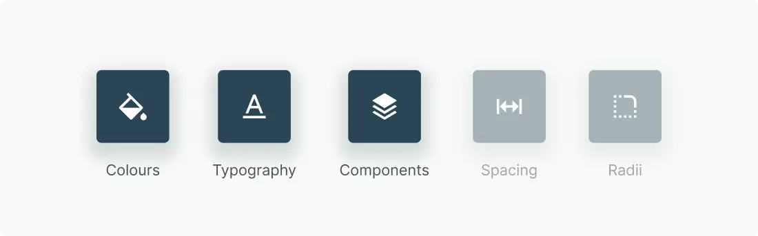
Most of the issues recorded came from colour structure and typography usage → component usage and variants. No font, spacing, radii or elevation changes were needed at this level.
Colour system redefinition
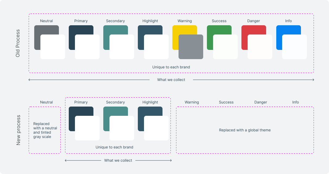
The existing structure required collecting multiple values during new client onboarding. These values were fed into my existing (templated) structure. I had little control over contrast, accessibility, luminosity and how the brand style fit into the already-defined WDX UI structure and components. This meant collected values wouldn't work seamlessly, requiring additional effort to modify, communicate changes to clients and resolve accessibility issues.
Therefore, I decided to adopt a different approach, opting for a 'one size fits all' themed solution.
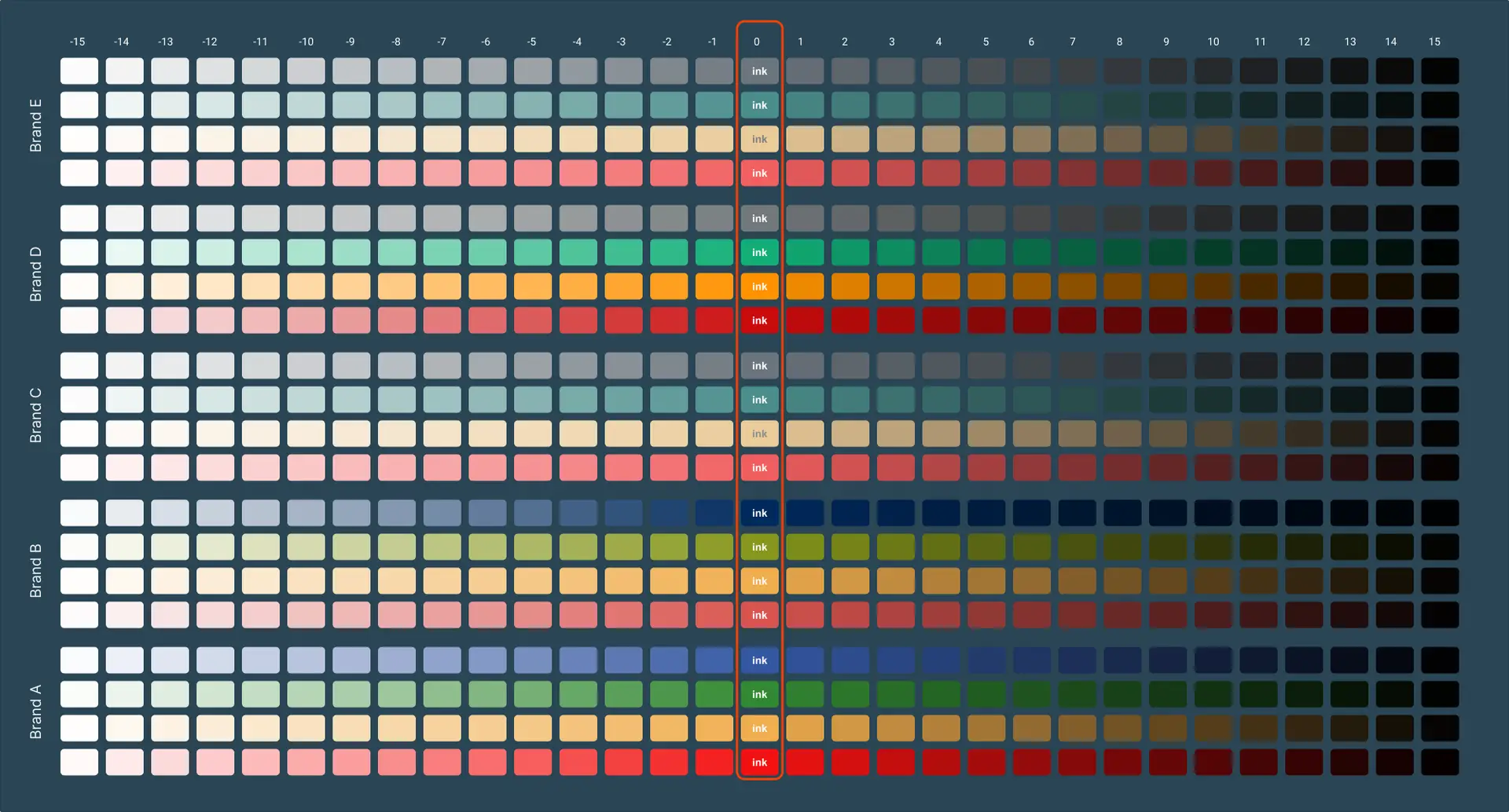
Complex structures require solid rules!
• One size should fit all – Providing a new structure: I had to ask a difficult question, "how much input do I actually need from clients to achieve a really bespoke UI?" Answer, not so much!
Every colour value I collect from newly onboarded clients would have its own palette within the design system at a low level, I don't really need that. So I set new rules, one size should fit all.
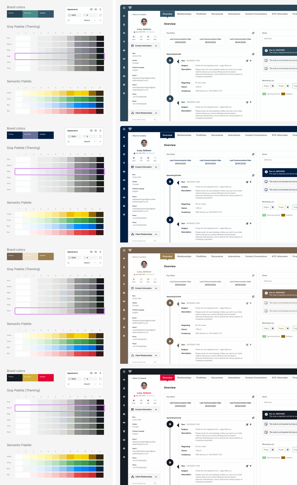
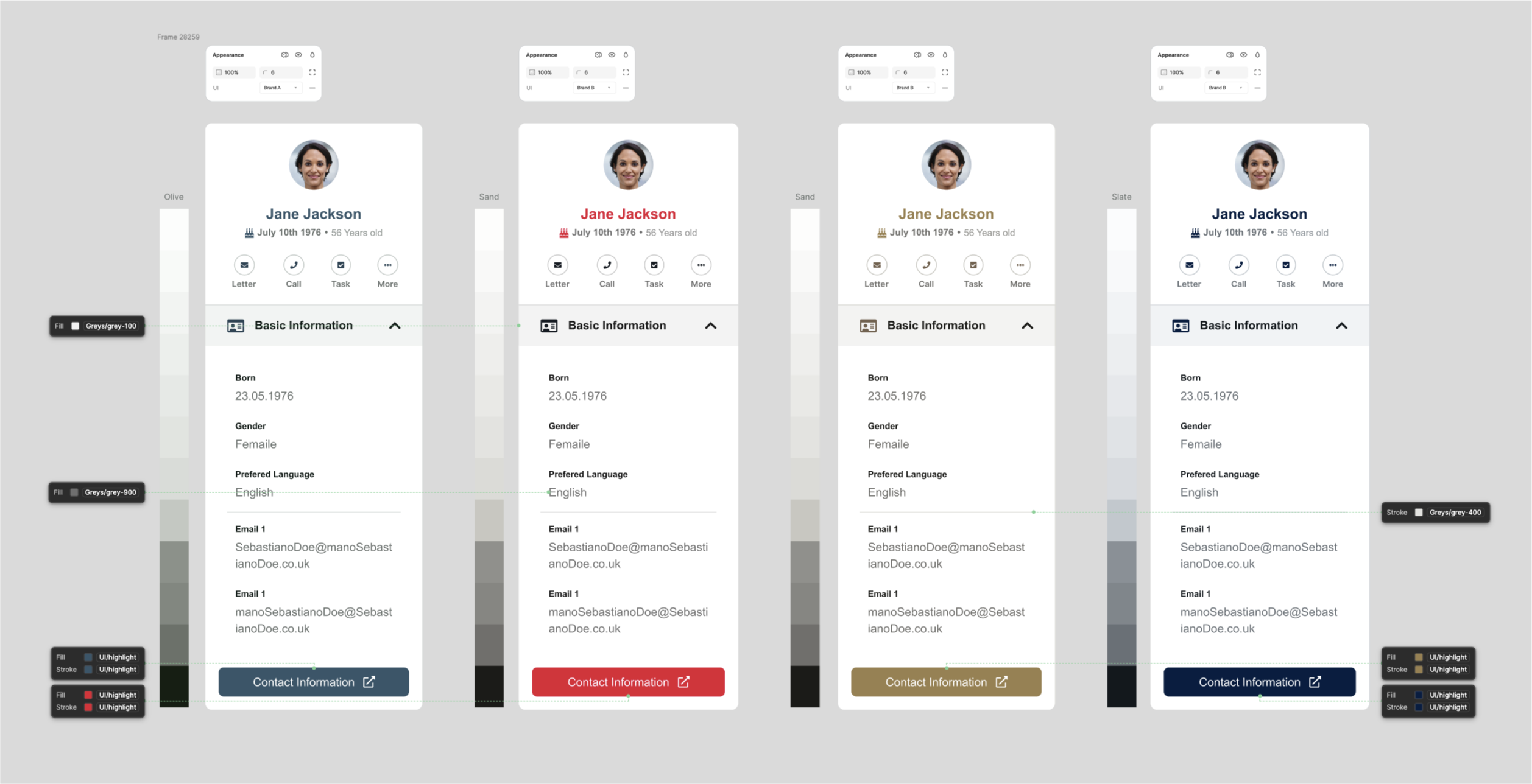
• Setting the rules = More control, simple, efficient and accessible multi-brand product: I replaced all greys with the Radix UI grey palette, which consists of six grey themes complementing the brand colour, including a completely neutral grey. A grey palette is assigned to clients based on the colour and temperature of their respective brand colours. Radix UI semantic colours were also used for simplicity.
This meant I could easily collect only 'brand colours' from clients and assign them a predefined grey/semantic theme… Happy days! These greys/semantics were designed to be accessible, well-balanced and harmonious.
Buy-in: informing teams & stakeholders of the new change
Created a new client onboarding document defining which brand collaterals and values to collect from clients during onboarding.
Held several meetings to communicate the proposed change and possible impacts on existing UI, all feedback positive from both ends, internal team and client product teams. Now, onto implementation.
Stage 03
Redesign: With a strong foundation in place, I rebuilt the components.
Application of new token / variable structures on existing, audited components, and implementing changes. Since I were parking the old design system, a new one had to be created.
Component library rebuild & documentation
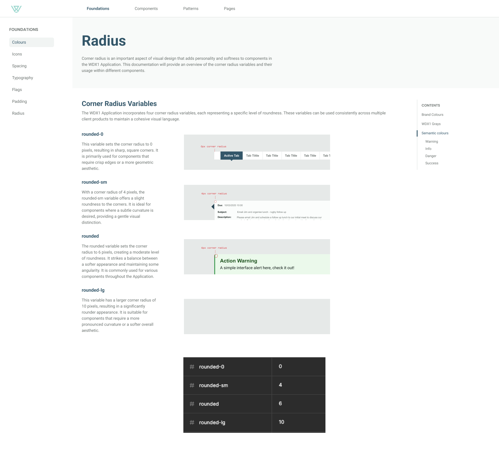
I built a centralised component library with clear naming conventions, improved functionality, and Figma variable integration for multi-brand use.
Changes and updates were tracked in Jira. I listed all existing components, consolidated duplicates, and created variants for components serving the same purpose. Icons in Figma were restructured, and detailed documentation was created for each component, ensuring clear guidelines for proper usage.
Once a component design was completed, it was tracked in Jira, moved to development and merged iteratively. Consistent communication kept all stakeholders informed of every new release, even those with minor UI changes. Given this was a live product with frequent use, rigorous testing ensured the new components didn't introduce issues on the platform. This iterative approach ensured a smooth transition without a disruptive 'big bang' change.
Stage 04
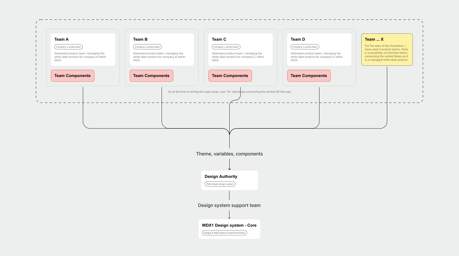
Restructure: Once the problems were identified, I tackled the underlying structure.
Training: I dedicated time to training users of the design system and teaching them how to consume it properly.
Workflow restructuring (Design Authority): I established a dedicated Design System workflow within the design authority to ensure ongoing maintenance and updates.
Impact
Design impact, learnings and future thinking
The design system established a common design language, enabling smoother communication between design and development. Developers focus on feature development instead of low-level UI details, designers create high-fidelity interfaces faster with a pre-built component library, and prototyping is faster, accelerating experimentation and A/B testing. Consistent design across the platform translates to a more intuitive, user-friendly experience.
Future thinking and learnings
The project highlighted several takeaways that will guide future work.
Iterative problem-solving
Small, incremental changes had significant impact on an existing product. A focus on continuous improvement keeps the design system relevant and effective.
Tokenisation and variables
Effective use of design tokens and variables streamlined design and development workflows, an approach worth leveraging in every future design system project.
Component library enhancements
Continued evaluation and improvement of the component library based on usage data and user feedback remains crucial.
Single-Page Application exploration
Investigating the potential benefits and challenges of migrating the platform to an SPA architecture is worthwhile.